eCorcoran
The Intranet for real estate agents to get the resources they need to close their deals.
Background
Corcoran is a real estate company and is redesigning its intranet, eCorcoran. Over 2,000 agents get the documents and resources they need for their day-to-day work at eCorcoran.
I am working as a UX designer collaborating with another UX Designer, product manager, and 3 developers to design and build a new eCorcoran to improve agents' satisfaction and working efficiency.
User Interview & Insights
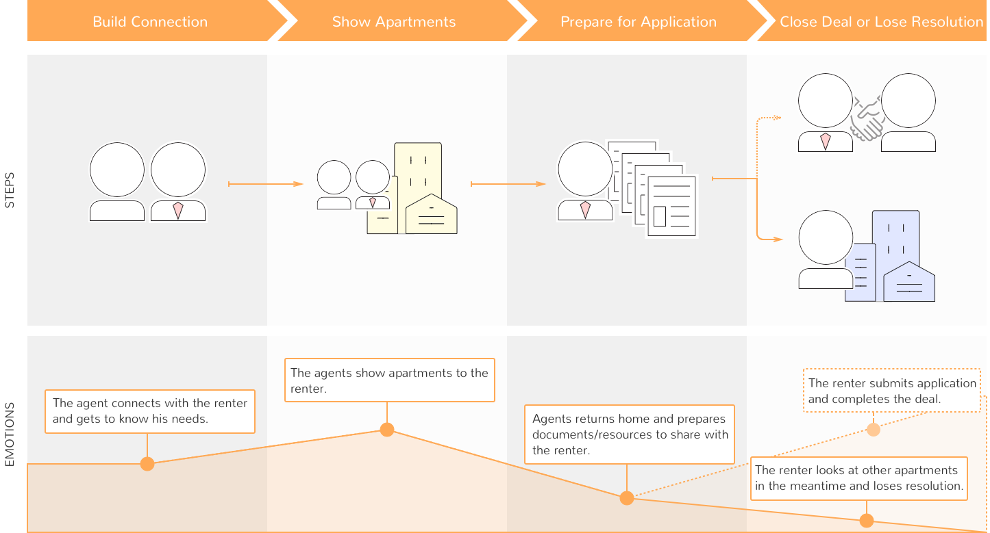
We conducted user interviews with agents to gather their stories, pain points, and expectation. I summarized agents' workflow and generated a user journey map showing the renting process.
By analyzing and synthesizing the information we gathered from user interviews, we were able to see four insights:
Insight 1: Searchability is weak because document retrieval is cumbersome.
Insight 2: Lack easy access to top or frequently used resources.
Insight 3: Unfriendly mobile experience; hard to use on the go.
Insight 4: Some agents are technically challenged, and they require simpler and more direct user interface.
Brainstorm
With the interview insights in mind, all team members started to brainstorm potential solutions and sketched out ideas independently. We presented our ideas/sketches to the team and voted for the ideas we liked the most.
After brainstorming, we defined the features for the MVP while considering time constraints and budget limitations.

Team Brainstorming Session
Design
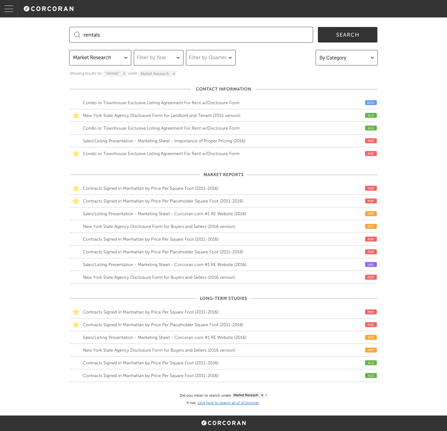
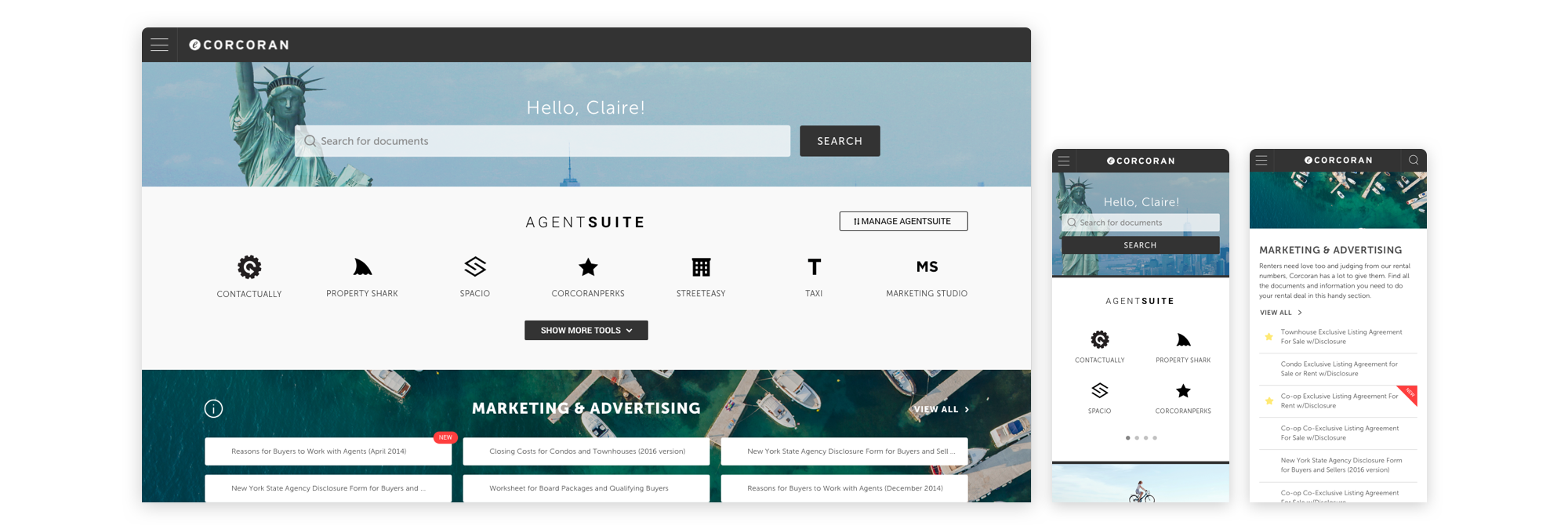
The structure of the new eCorcoran very simple. There are two pages: homepage and search page.
Solution 1: Powerful Search Engine
-
Filtering and sorting enables agents to drill down into subsets of search results.
-
Autocomplete provides suggestions while agents type into the field.
-
Constant access to search bar at top of the screen.
Solution 2: Personalized Content
-
Homepage content is customized based on region and user type.
-
Links and documents were ordered by popularity and date to bring out the most frequently used and most recent resources to the top.
-
Users can mark the documents they use frequently and have easy access to them.
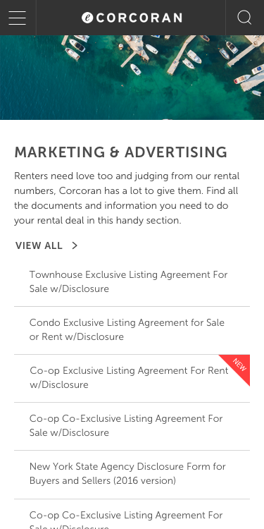
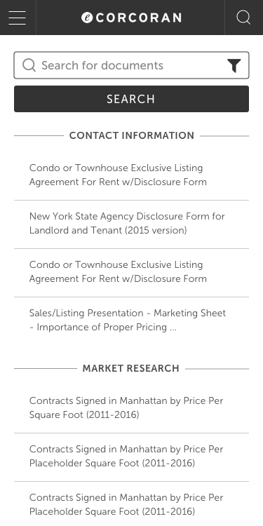
Solution 3: Responsive Design
-
Optimized for any mobile device.
Feedback
After we released the new eCorcoran for one and a half months, we boosted the satisfaction ratings from 45% to 85%. People are saying:
"The new eCorcoran is great ... 10,000x better!" - SoHo Agent
"Agents love the look and ability to search. It is a huge improvement." - Hamptons Manager
"Totally awesome. One stop shopping." - Brooklyn Agent
"So impressed! Thank you all for your hard work." - East Side Agent
Iteration
In order to improve agents' satisfaction even further, we conducted usability test with agents. We assigned agents certain search tasks and observed how they accomplish their tasks. We also had face-to-face conversations with agents to collect their feedback.
Agents' main complaints were:
Complaint 1: Too much scrolling on all pages.
Complaint 2: The organization of the search results is difficult to understand.
Complaint 3: AgentSuite section is overwhelming and confusing.
Based on agents' feedback, we made the following enhancements:
Enhancement 1: A more condensed layout shows more information on one screen.
Enhancement 2: Customized filters for different sections. Hints to teach agents how to get better search results.
Enhancement 3: Allow agents to personalize their AgentSuite section.
My Contribution
UI Design, UX Research, Front-End Development.
Tools Used
Sketch, Invision, HTML, CSS, jQuery, Bootstrap.
